Introducing My Curated Art Collection for Minted Rare Editions
We may receive a portion of sales if you purchase a product through a link in this article.
For me, travel is the ultimate way to unlock inspiration. Shifting my environment and immersing myself in an entirely different culture helps me see the world through a new lens. When I return home, I’m energized and excited to incorporate a fresh aesthetic into my space. And my family’s recent trip to Ibiza achieved exactly that. The sun-bleached color palette, works by Spanish abstract expressionists, and vibrant beaches—all of it was a feast for the senses. It was the exact creative inspiration I was craving. And, I got to put it into play as I curated my new Rare Editions Collection collaboration with Minted.
I approach design with the idea that whatever I bring into my home should be beautiful, functional, and meaningful. (It’s ideal if I can check all three boxes.) Minted’s Rare Editions Collection aligns perfectly with that approach. As a capsule collection with a limited run of one-of-a-kind works, Minted makes it simple to curate a narrative of purpose, connection, and beauty through art.
And though decorating with art is an easy and impactful way to elevate your home, there are a few things to keep in mind to ensure you create exactly the right look for you. Ahead, I’m diving into tips and tricks for sourcing meaningful art and how to style it in your home. Be sure to read to the end, where I’m diving into all my favorite pieces from Minted’s Rare Editions Collection and the inspiring stories behind the works.
How to Source Meaningful Art
I get it: shopping for art can be intimidating. So many of us often get bogged down by the question of whether or not something’s “good.” PSA: That’s entirely subjective—and up to you to decide. To source and shop for art that adds character to my home and infuses my walls with personality, I lean into my intuition to guide the way. I’m sharing my process and tips below for finding the perfect pieces for your space.
- Practice patience. Finding the right piece takes time. Full stop. When you have blank walls staring you in the face, it can be tempting to pick up any old piece. But finding meaningful art shouldn’t be seen as a means to an end. Instead, embrace the process. Art is a beautiful opportunity to express your tastes—allow yourself to lean into that journey of discovery and the creativity you’ll explore along the way.
- Trust your gut. Again, it comes back to your intuition. We can spend so much time questioning the purpose or meaning of a piece when instead, it’s often as simple as noticing how it makes you feel. Does it captivate you, stir up emotion, or spark inspiration? If so, take that as a sign to follow.
- Reflect on the emotions a piece evokes. As they say: when you know, you know. When I come across a work that I can’t get out of my head, I take that as a sign. If you love the piece on its own, think about how much joy it’ll bring you every time you see it in your home.
Tips for Styling Art in Your Home
Remember: your home is a reflection not only of your unique taste but the experiences you’ve amassed over the years. When styling art, I’m always after a look that feels dynamic and layered but complementary and harmonious to the rest of my home. It’s a balance of making a statement with bold pieces and paring back to create intimate vignettes. These are my go-to tips for styling art in your home.
Use a cohesive color palette as your foundation
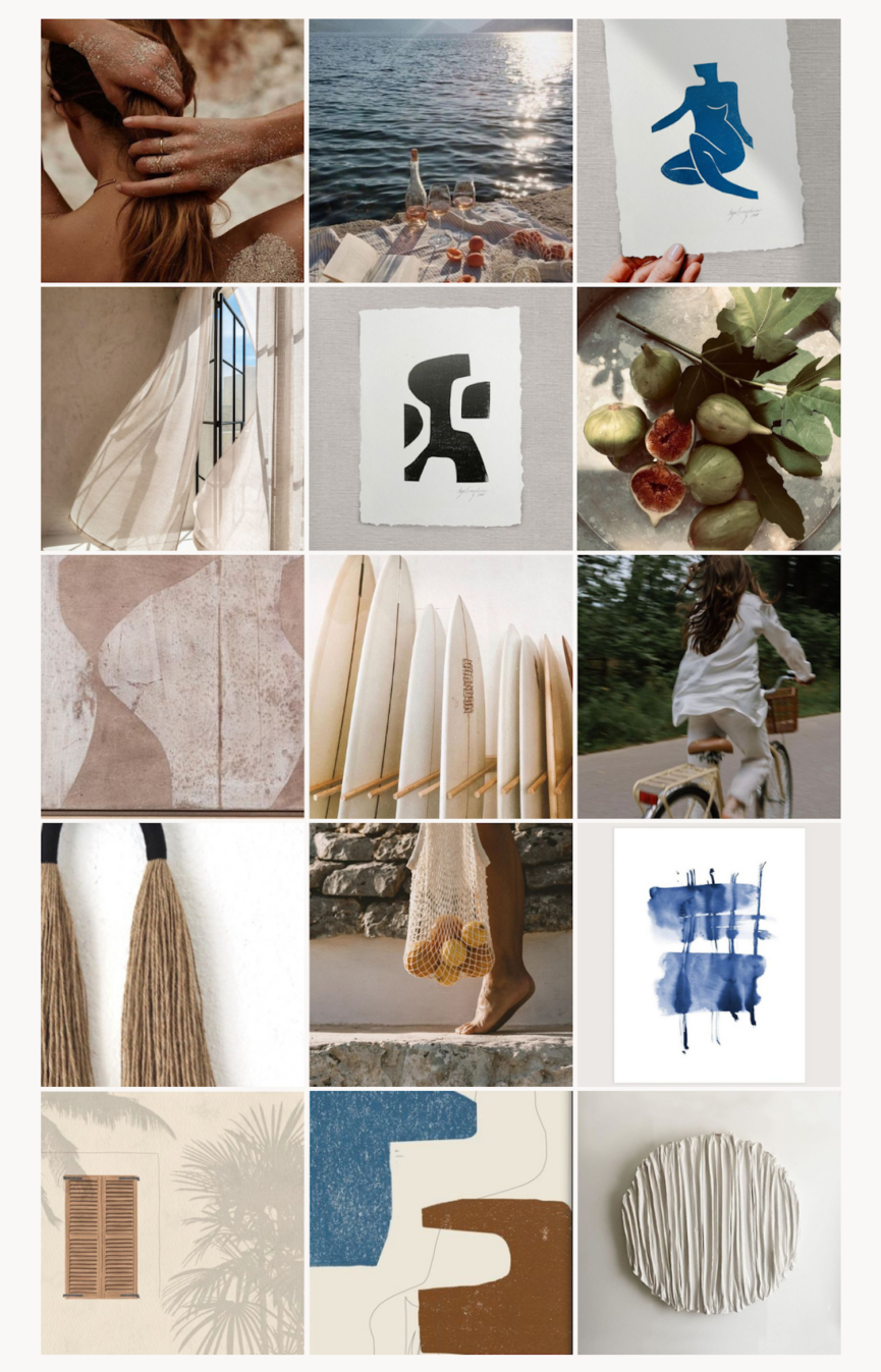
Who doesn’t love a mood board? Before taking on any project, I like to first develop a look and feel. To do this, I start with a few words that represent the ultimate look I want to achieve. When it came to curating my Rare Editions Collection with Minted, I wanted the pieces to reflect a sun-bleached palette, leaning into shapes inspired by sensual curves and terra cotta.
From there, I gathered images that represented these words and composed them into a mood board. (See image above.) Think of it as a road map to provide further insight into the pieces you select—and how you’ll style them in your home.
Try a gallery wall
Nope, it’s not just a fleeting trend of the 2010s. Gallery walls let you be playful with your styling, and the best balance a pull toward maximalism with a cohesive, grounding feel. I also love that gallery walls let you incorporate both beautiful pieces and those that might lean more nostalgic (such as family photos). Again, this is where your mood board will be important—because you’ll be styling several pieces in one space, it can become cluttered quickly. Remember the look you want to achieve and let that lead the way.
Create a focal point
Much of styling art depends on your ability to capture the eye and focus the gaze. If you’ve been here for a while, you’ll know I love hanging large statement pieces above my living room fireplace or over my bed. (Peep my house tour for a visual.) Because of the size and scale, whatever piece you select will influence the feel of your space—creating impact while still feeling streamlined.
Go beyond the wall
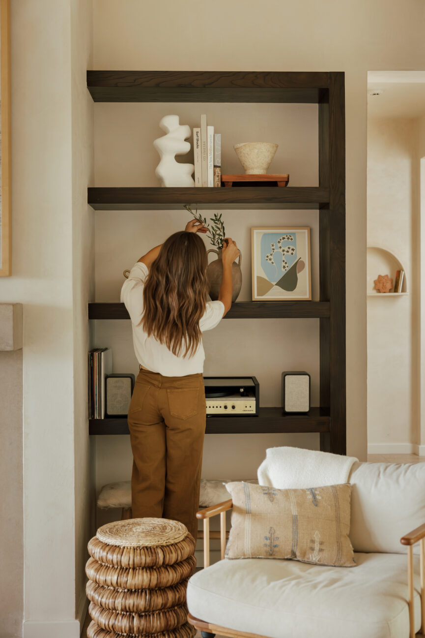
This is one of my favorite styling tricks. So often, we think art belongs exclusively on our walls, but it can be fun and give a fresh feel to your space to hang or lean art in unexpected ways. Y’all know I love a styled bookshelf moment, and layering smaller pieces alongside decorative objects (such as bowls, vases, and books) is a simple way to add character and interest. You can also prop pieces up on the mantel or lean it against a shelf in the kitchen. And don’t be afraid to hang art in unexpected places. Anything from the laundry room to the guest bath are all fair game.
My Rare Editions Collection for Minted
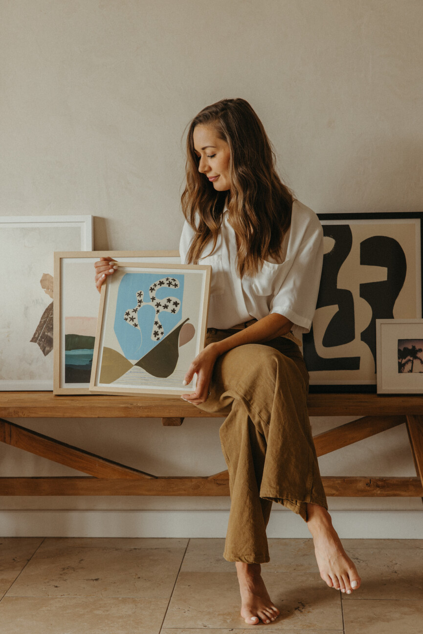
And now, let’s dive into my Rare Editions Collection with Minted! As a brand dedicated to showcasing innovative work by independent artists all over the world, teaming up with Minted was the perfect way to bring resonant, meaningful pieces to my home—and share these works with you.
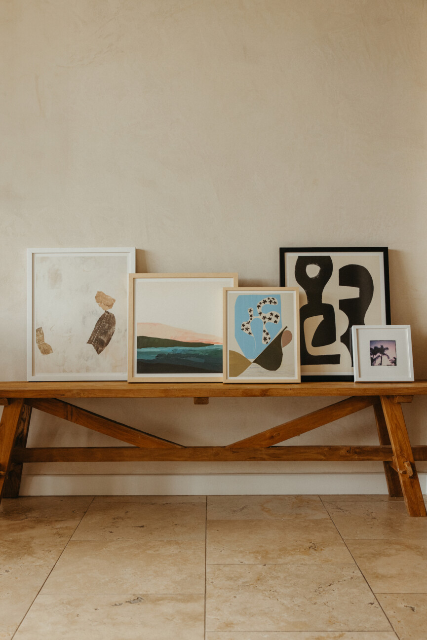
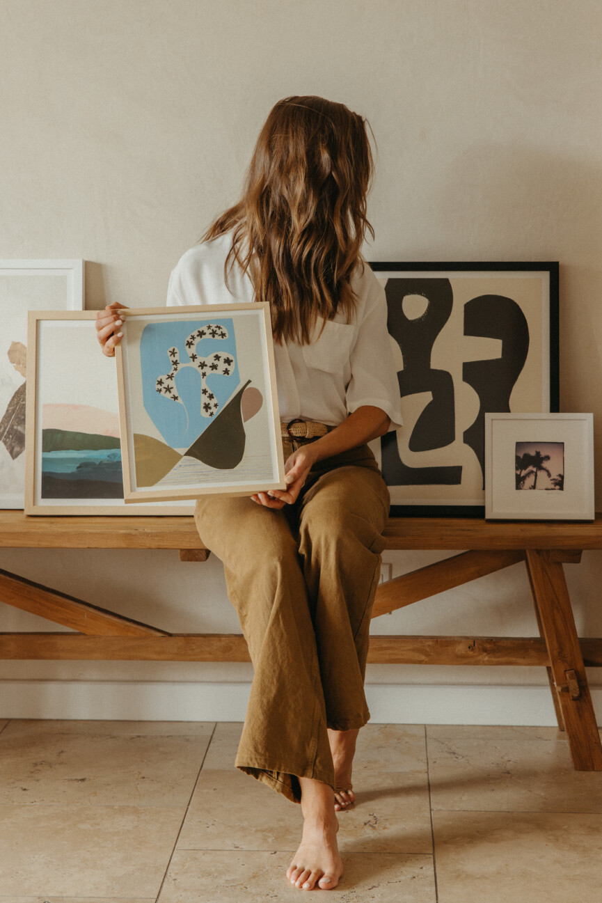
What makes this collection so special, beyond the stunning works themselves? To start, each piece is part of a limited run, meaning that you’re one of only five people with the work in your home. What’s more, they each feature the artist’s signature in graphite pencil and are uniquely numbered. Lastly, I love how much care and attention was given to the framing. Each work features a handmade frame selected in a finish that best complements the piece.
All of these elements come together to create a thoughtful, considered collection that honors the intention woven into each of the works. Ahead, learn more about the pieces I selected for my capsule collection as well as the inspiring stories behind the artists who created them.
Ilana Greenberg
Brooklyn-based painter, illustrator, and graphic designer Ilana Greenberg pairs minimal, clean forms with nods to imperfection. She describes her work as urban vintage, culling inspiration from mid-century artists as well as her surrounding environment.
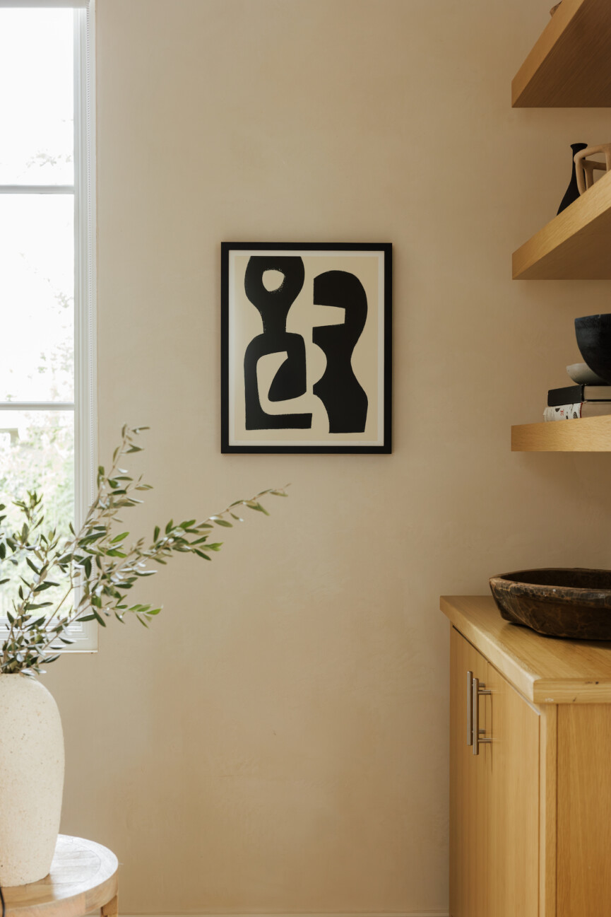
The Work: Perfect Composition
I immediately connected with this piece’s emphasis on black and white sensual shapes. My office was the perfect place to house it—contrasting the painting’s bold, geometric forms with the room’s softer palette.
Kamala Nahas
Based in Southern California, Kamala Nahas has always connected with photography’s ability to capture perspective and represent our experience. She excels in spontaneous compositions, responding to her senses and emotions to construct a moment. Rather than documenting a place, she sets out to capture its essence and how its elements makes her feel.
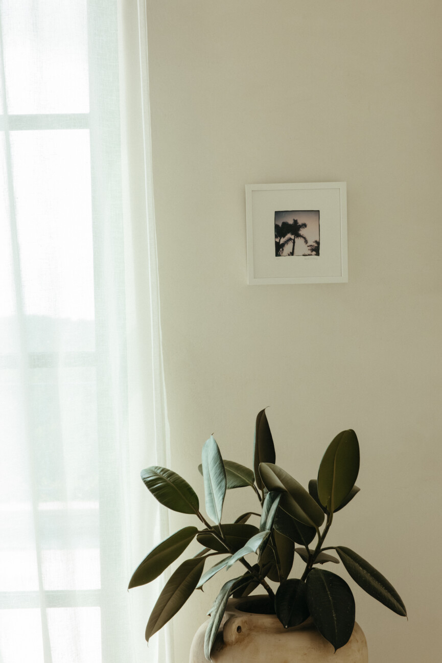
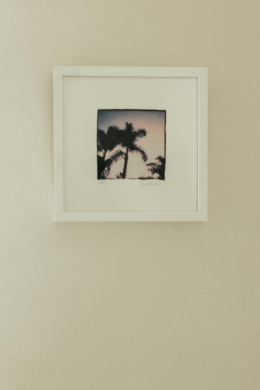
The Work: Twilight Palms
Kamala’s process in capturing this photograph speaks to the care and consideration she gives all of her work. She first took the image using a 1970’s era Polaroid SX-70 instant camera. Then, she gently separated the photograph’s layers by hand to reveal the image within. Using water again, she transferred the thin emulsion to heavy cotton fine art paper and finished it with a UV resistant varnish. For Kamala, it’s evident that the exploration and experimentation inherent in creating a piece is just as exciting as the final, visual result.
This piece’s smaller dimension lends itself well to an intimate corner. I hung it next to the window to complement the soft sunlight trickling through the curtains, and placing it above a rubber plant further emphasizes its verdant, nature-driven feel.
Bethania Lima
Brazilian surface designer Bethania Lima is passionate about pattern, color, and design. Having lived in Chile for the past decade, she recently relocated to Uruguay. She’s currently exploring the ups and downs of a freelance career, attributing much of her success to the loving support of family and friends.
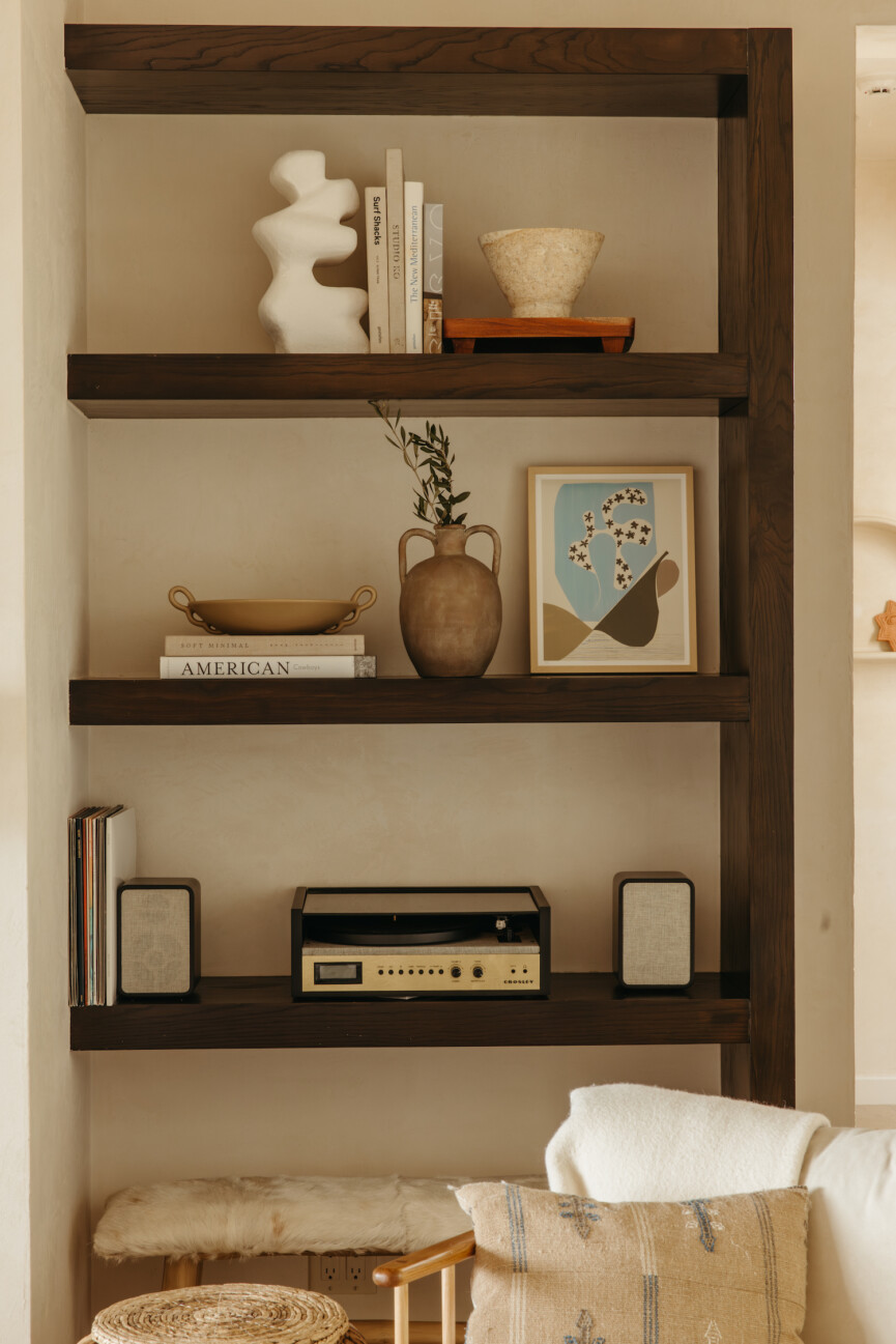
The Work: Seashore Findings
I saw a Matisse exhibit a few months back that showcased many of his cutouts. I immediately fell in love with the organic shapes and vibrant colors. This piece resonated with me in the same way, drawing me in through its layered hues and varied, but harmonious forms. I propped it up on my living room bookshelf to infuse a little color into the space and to play up the patina of my favorite clay vessels and vases.
Jennifer Daily
Jennifer Daily has been painting and designing since she was a teenager. Now, with a degree in Graphic Design, she creates pieces that draw inspiration from the Bay Area’s vibrant cultures and varied climates. Her pieces lean on simplified forms and neutral color palettes to communicate her push for fewer distractions in both her art and life.
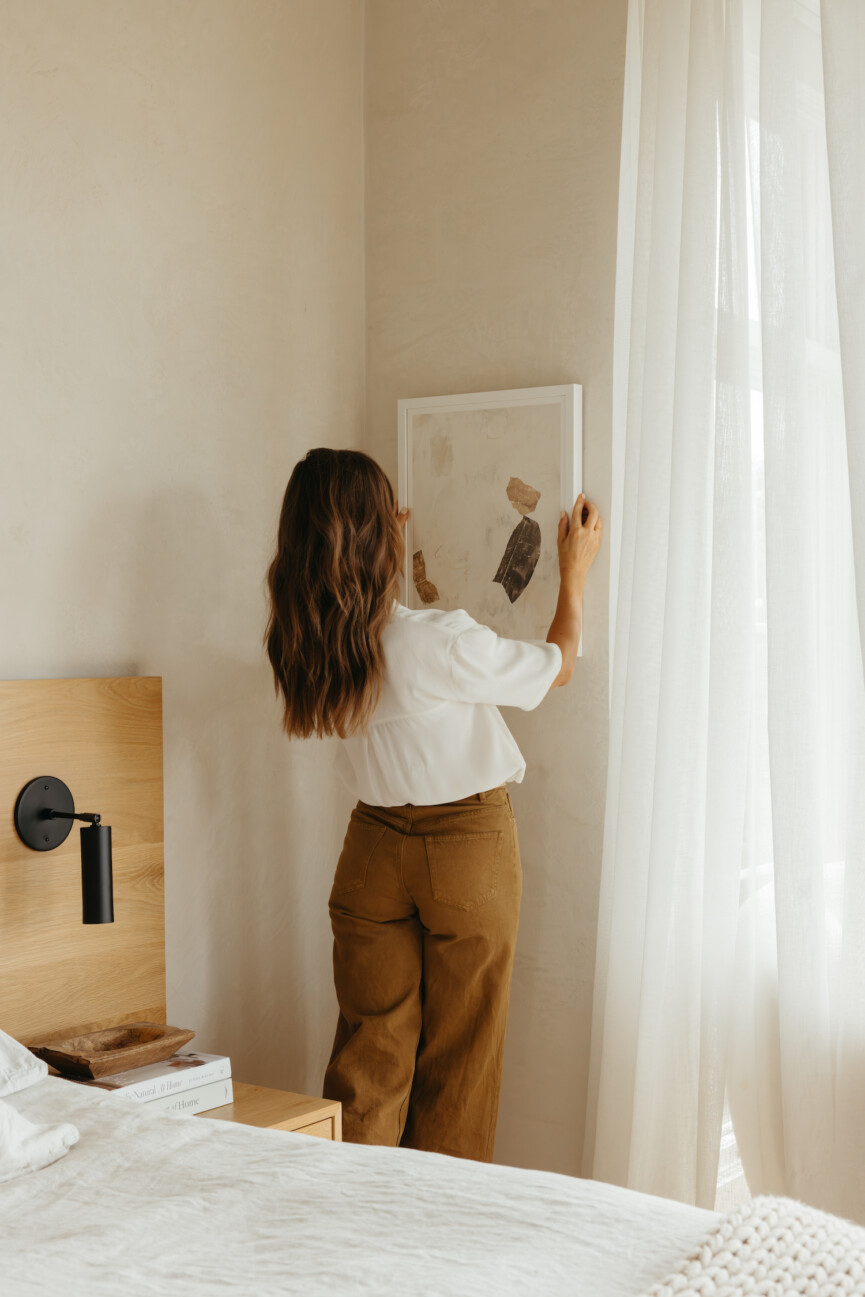
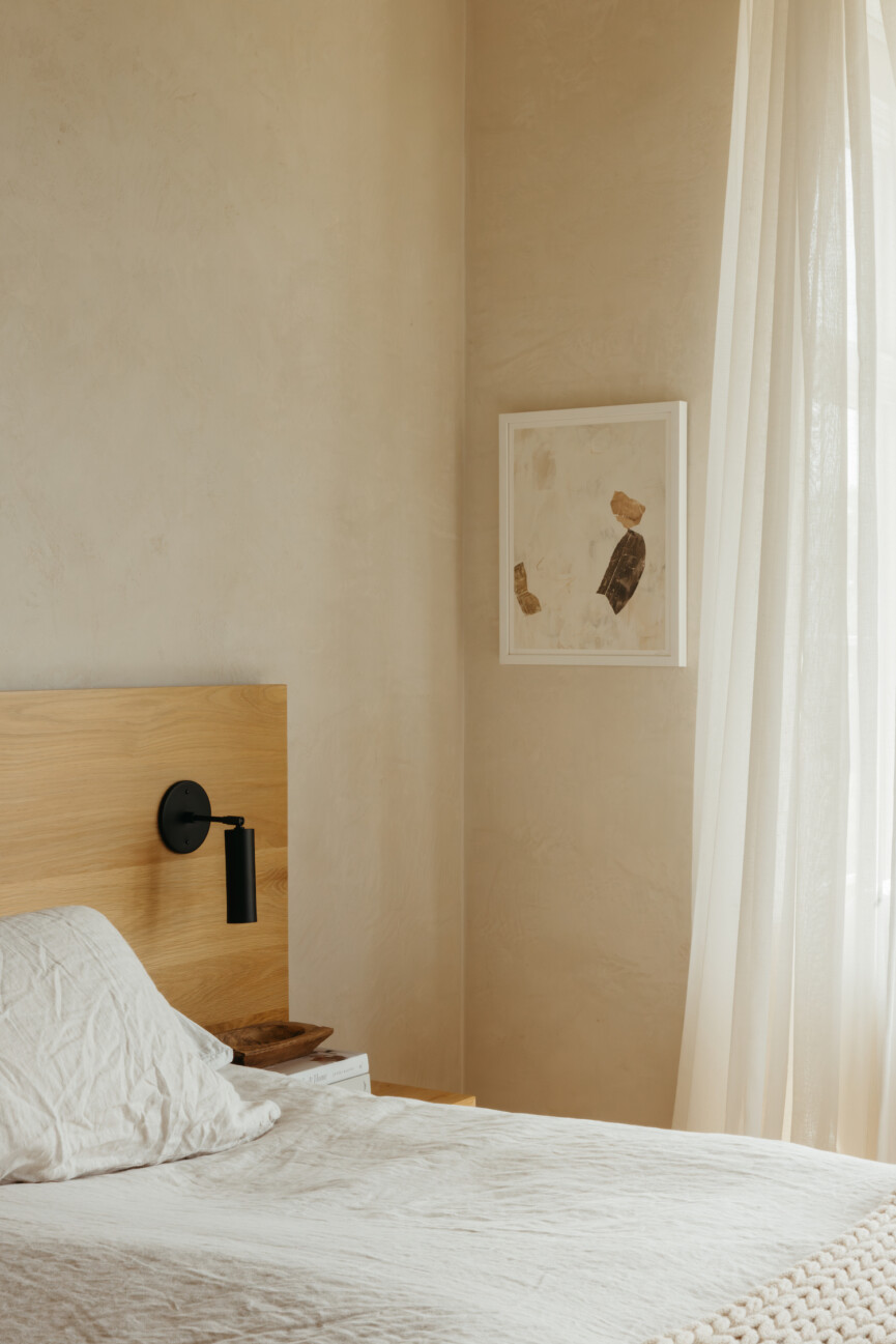
The Work: What We Will Become
“A life can be seen as the process of unfolding,” Jennifer writes. Moment to moment, we surprise ourselves by all there is to discover along the path of growth. This is how Jennifer approaches every work—asking “what if” to drive at new desires, new paintings, and new ways of being. I hung this in the corner of our bedroom to echo the soft, light wood of the bed frame. It has a calming and grounding effect that’s exactly the vibe I’m going for.
Caryn Owen
Caryn Owen is an inspiring multi-hyphenate, having balanced her art with motherhood and a career as a marine biology professor for years. Based in Santa Cruz, California, Caryn left the field in 2014 when she dove into art full-time. Specializing in acrylic paint on canvas, Caryn focuses her work on abstract landscapes and botanicals as well as pure abstract expressionist paintings that explore the boundaries of color.
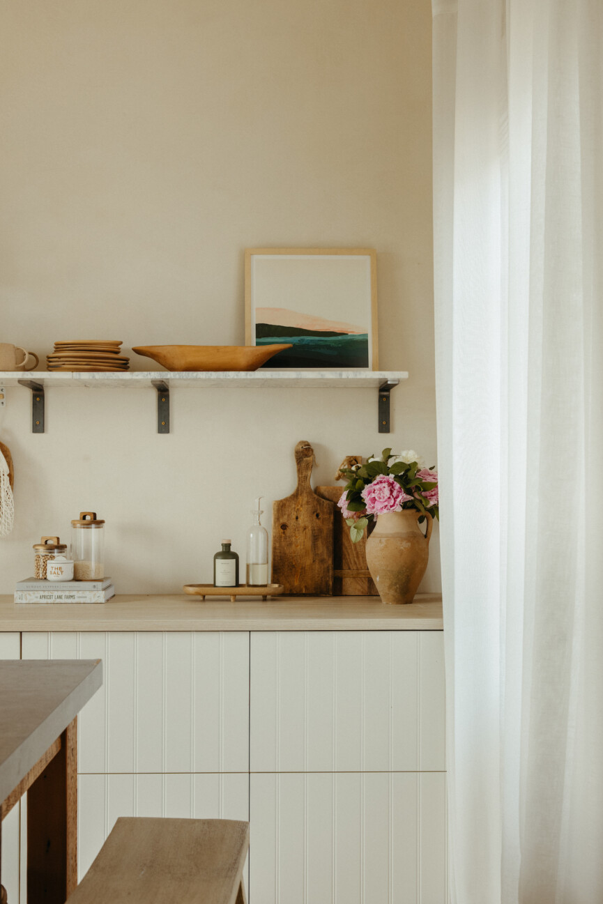
The Work: Santa Cruz Seascape
This vibrant abstract landscape is painted on stretched canvas, connecting the viewer to the energetic quality of Northern California’s coast. As a self-professed colorist, Caryn seeks to represent the intensity of color in lieu of literal forms. I immediately connected with this piece’s layered colors—a reminder that nature is often more layered and contains greater depth than we initially see.




Leave feedback about this